组件与插件
2025/6/3...大约 4 分钟
组件与插件
组件
在主题配置上开启组件
    components: {
      components: [
        "SiteInfo", # 页面信息
        "VidStack", # 视频播放器,支持油管
        "ArtPlayer", # 视频播放器
        "BiliBili", # B站视频
        "PDF", # PDF预览
        "Share", # 社交媒体分享
        "Badge", # 徽章标记
        "VPCard", # 卡片
        "VPBanner" # 横幅
      ],
    },
SiteInfo 站点卡片
基础样式
<SiteInfo
  name="Mr.Hope's Blog"
  url="https://mister-hope.com"
  preview="https://theme-hope.vuejs.press/assets/image/mrhope.jpg"
/>
更多配置
<SiteInfo
  name="Mr.Hope's Blog"
  desc="Where there is light, there is hope"
  url="https://mister-hope.com"
  logo="https://mister-hope.com/logo.svg"
  repo="https://github.com/Mister-Hope/Mister-Hope.github.io"
  preview="https://theme-hope.vuejs.press/assets/image/mrhope.jpg"
/>
VPCard 卡片信息
基础卡片
<VPCard
  title="Mr.Hope"
  desc="Where there is light, there is hope"
  logo="https://mister-hope.com/logo.svg"
  link="https://mister-hope.com"
  background="rgba(253, 230, 138, 0.15)"
/>
其他配置项
- color:字体颜色
为了让背景和字体颜色能自动适配夜间模式,你可以传入 css variable,如:
var(--my-bg)。
多卡片阵列
<div class="vp-card-container">
  <VPCard
    v-for="i in 12"
    title="Mr.Hope"
    desc="Where there is light, there is hope"
    logo="https://mister-hope.com/logo.svg"
    link="https://mister-hope.com"
    background="rgba(253, 230, 138, 0.15)"
  />
  <VPCard
    title="Mr.Hope"
    desc="Where there is light, there is hope"
    logo="https://mister-hope.com/logo.svg"
    link="https://mister-hope.com"
    background="rgba(253, 230, 138, 0.15)"
  />
  <VPCard
    title="Mr.Hope"
    desc="Where there is light, there is hope"
    logo="https://mister-hope.com/logo.svg"
    link="https://mister-hope.com"
    background="rgba(253, 230, 138, 0.15)"
  />
</div>
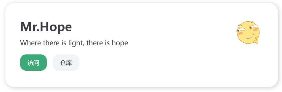
VPBanner 横幅
基础语法
<VPBanner
  title="Mr.Hope"
  content="Where there is light, there is hope"
  logo="https://mister-hope.com/logo.svg"
  :actions='[
    {
	  text: "访问",
      link:"https://mister-hope.com",
    },
	{
	  text: "仓库",
	  link: "https://github/Mister-Hope/Mister-Hope.github.io",
	  type: "default",
	},
  ]'
/>
配置项
- title:标题,必填
- content:描述内容
- logo:图标
- actions:操作链接
- text: string
- link: string
- type:
"primary"|"default",默认"primary"
- background:横幅背景
- color:字体颜色
为了让背景和字体颜色能自动适配夜间模式,你可以传入 css variable,如:
var(--my-bg)。
PDF 组件
主题配置
    components: {
      components: [
        "SiteInfo",
        "VidStack",
        "ArtPlayer",
        "BiliBili",
        "Share",
        "PDF",
        "Badge",
        "VPCard",
        "VPBanner",
      ],
      componentOptions: {
        pdf: {
          pdfjs: "/pdfjs",
        }
      }
    },
MD 语法
<PDF
  url="https://pan.811520.xyz/daoyi/崇阳房地产市场产品走势研判-道怡.pdf"
  viewer="true"
/>
示例效果
见官方文档
配置项
- url:PDF 链接
- width:宽度,默认值:
100% - height:高度
- ratio:宽高比,默认值:
16 / 9,只有当未指定height时有效 - viewer:true / false,是否强制使用 PDFJS 查看器
- page:初始页面,默认值
1,此属性仅在基于 Chromium 内核的浏览器上有效 - zoom:初始缩放比例,默认值:
100,此属性仅在基于 Chromium 内核的浏览器上有效
让移动浏览器支持 PDF 预览
从 github 下载最新的 PDFJS 查看器,然后将其复制到
.vuepress/public文件夹。 之后,在组件选项中将componentOptions.pdf.pdfjs设置为<BASE><public 文件夹内的相对路径>,如/pdfjs
noToolbar 支持: 默认的 PDFJS 查看器不支持自定义工具栏,如果你想添加这个功能的支持,你应该手动将以下代码添加到在 pdfjs 文件夹中的 web/viewer.html 的 <script src="viewer.mjs" type="module"></script> 行之前:
  <link rel="stylesheet" href="viewer.css">
  <script>
    if (location.hash.includes("toolbar=0")) {
      const style = document.createElement("style");
      style.textContent = "#toolbarContainer { display: none; }";
      document.head.append(style);
    }
  </script>
  <script src="viewer.mjs" type="module"></script>
Share 分享组件
基础语法
<Share />
自定义分享平台 (彩色图标)
<Share colorful
  services="qq, weibo"
/>
支持的平台
douban、email、evernotefacebook、flipboard、line、linkedin、messenger、qq、qzone、qrcode、skype、sms、telegram、tumblr、twitter、weibo、whatsapp、wordpress
Badge 徽章
基础语法
## 标题徽章 <Badge text="新" type="tip" /> <Badge text="MrHope" color="grey" />

徽章测试 <Badge text="构建中" type="warning" /> <Badge text="MrHope" color="grey" />
配置项
- text:徽章的文字,必填
- type:徽章的类型,
"tip" | "warning" | "danger" | "important" | "info" | "note",默认值"info" - color:颜色,填入在 CSS 中合法的颜色值
- vertical:垂直方向的位置,类型:
"top" | "middle" | "baseline" | "bottom"
VidStack 音视频组件,支持油管
ArtPlayer 视频组件
BiliBili B 站视频
插件
Catalog 生成目录页面并自动排序
目录信息应包含
title: 目录标题order: 目录顺序 (可选)content: 目录内容组件 (可选)
该插件默认会全局注册一个 <Catalog /> 组件(除非你设置了 component 选项)。
你可以在主题布局中或直接在 Markdown 文件中使用 <Catalog />。
组件支持四个属性
level:更改显示层次深度(最大仅支持 3 层),默认为3。base:显示指定文件夹的目录,默认显示当前文件夹目录。index:为目录项添加索引号,默认无标号。hideHeading:隐藏组件标题,默认会显示目录标题。